What do your label colours say about your brand?
When it comes to great label or packaging design—or any design, for that matter—there’s more to it than just looking good.
There’s actually a little psychology involved.
Our brains—and the brains of our customer—translate certain design elements (and particularly colours) into meaning. The brightness, contrast and even just the hue you choose can have an impact on how your brand is perceived and what potential customers think of you—even before they know a single fact about your business.
According to many studies, including one by the University of Winnipeg, people make up their minds about a product within seconds of seeing it—and anywhere from 62 to 90 percent of that evaluation is based on colour alone.
So take a moment and think: What are your label and packaging colours saying about your brand? What first impression are they giving off? Use the colour associations below to help you evaluate:
Blue
Blue is the most widely used colour in logos, branding, label and packaging design. And, it has a whole slew of meanings and associated emotions. Bright blues, for example, are fresh, energising and exciting, while light, pastel blues are more welcoming and calming. Darker blues, on the other hand, convey confidence, trustworthiness and wisdom.

Image: Freepik
Associations: Courageous, calming, corporate, stable, loyal, knowledgeable, confident, trustworthy.
Green
Green can give off a natural, healthy or environmentally-friendly vibe or convey wealth, money and affluence. It all depends on the brightness, complementary colours and shades you use.
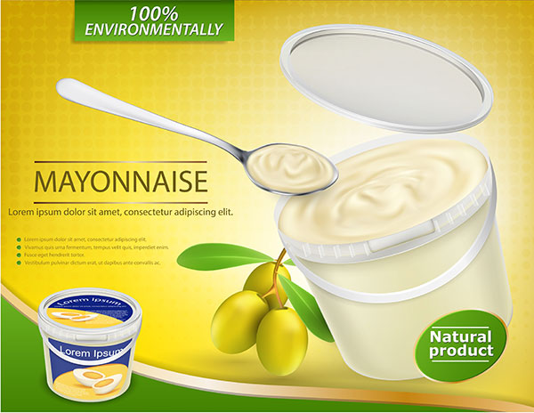
Image: Freepik
Associations: Wealthy, ambitious, natural, healthy, fresh, growing, renewal.
Brown
Brown is another natural-feeling hue, which gives off earthy, durable and rustic feelings. It can also be used to convey history, durability and sustainability. We see this a lot in organic food and beverage products including wine.

Image: Freepik
Associations: Earthy, natural, simple, durable, rustic, historic, sustainable.
Black
Black holds a lot of power in design. It can be used to convey mystery, elegance or luxury, or it can it be more of a functional colour, communicating simplicity and usefulness.

Image: Freepik
Associations: Powerful, mysterious, elegant, luxurious, sophisticated, prestigious, functional, classic, simple.
Yellow
Yellow is a largely optimistic colour, giving off a warmth and brightness that few other hues can provide. It is hopeful, happy and, at times, even childlike. Yellow, along with red, is also widely used in food packaging and marketing because it evokes the tastebuds and stimulates the appetite.
Image: Freepik
Associations: Warm, light, positive, optimistic, childlike, fresh, bright, happy, tasty, hopeful.
Red
It might sound hard to believe, but red actually has a physical impact on people, raising their heart and respiratory rates and even increasing their blood pressure. It’s also a powerful appetite stimulator, especially when paired with yellow. It’s a passionate, provocative and sometimes even aggressive colour that should be used boldly and with care. Red can also be used as a warning.

Image: Freepik
Associations: Courageous, aggressive, hungry, provocative, powerful, passionate, dangerous.
Orange
Like yellow, orange is a bright and vibrant colour, giving off a cheerful, fun and friendly vibe. It’s youthful, creative and enthusiastic, and it’s often associated with products and brands aimed at younger audiences.
Image: Freepik
Associations: Playful, youthful, cheerful, creative, enthusiastic, vibrant, fun, friendly, welcoming.
Pink
Pink is often seen as a more feminine colour and can be used to convey romance, beauty and gentility. It’s widely used in the beauty industry for good reason.

Image: Freepik
Associations: Romantic, feminine, beautiful, gentle, kind.
White
Often used as a contrast colour or to let another hue have more voice, white is a blank slate, conveying purity, softness and virtue. It’s used by many in the dental and medical fields to communicate cleanliness and sterility.

Image: Freepik
Associations: Purity, soft, clean, virtuous, sterile.
Gold
Signifying exclusivity and eliteness, gold is a rich and elegant tone often used as an accent colour on higher-priced products, such as alcohol or cosmetics, or those aimed at a more affluent audience.
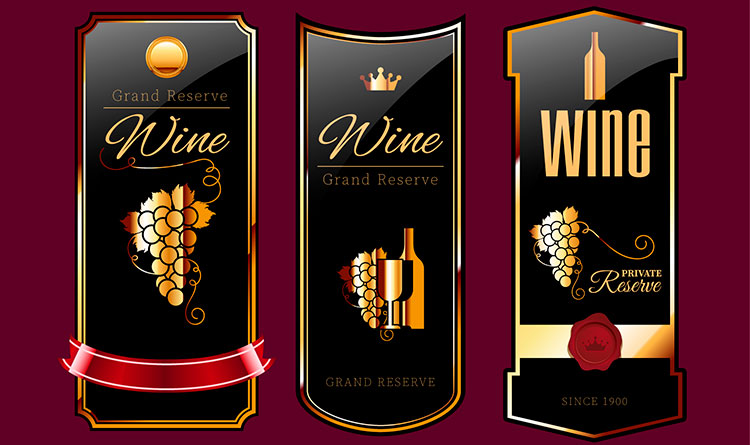
Image: Freepik
Associations: Elegant, rich, affluent, exclusive, high-quality, elite.
What do your brand colours say about you?
Make no mistake about it: Colour plays a huge role in your brand’s and product’s recognition. What are your label and packaging colours currently saying about you?
Not sure? We can help. Contact us today for an obligation free conversation.


